Designing a Conversion-Focused Product Quiz for Made by Nacho
Deliverable
User flow, High-fidelity screens, Interactive prototype
Timeline
Sep 2025
Project Overview
Made by Nacho is a premium cat food brand founded by celebrity chef Bobby Flay. The client wanted a product recommendation quiz to help cat owners find the right food for their pet. They came with five questions. Everything else — the flow structure, the experience design, the results page — was ours to define.
Challenges
The harder problem wasn't the quiz — it was the end.
A results page that drops users onto a generic PLP loses all the momentum built through the experience.
The results page had to do real conversion work: surface the right products, remove friction, and make it easy to go from recommendation to cart.
Background
Defining the Flow
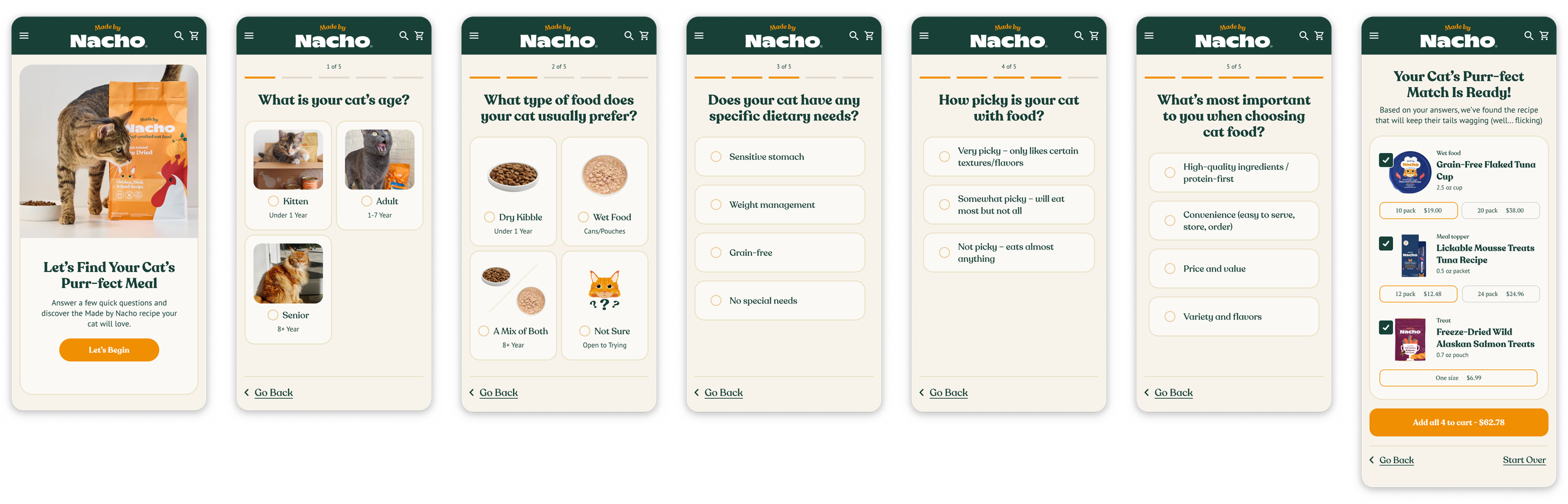
7-step journey from five client-provided questions
Landing page → Q1 → Q2 → Q3 → Q4 → Q5 → Results
The client provided five questions. From there I mapped out the full 7-step journey — adding a landing page to set context and a results page designed for conversion.
Each question screen needed to feel fun and fast so users don't drop off mid-flow. The results page was where the real UX work lived.
Quiz Experience
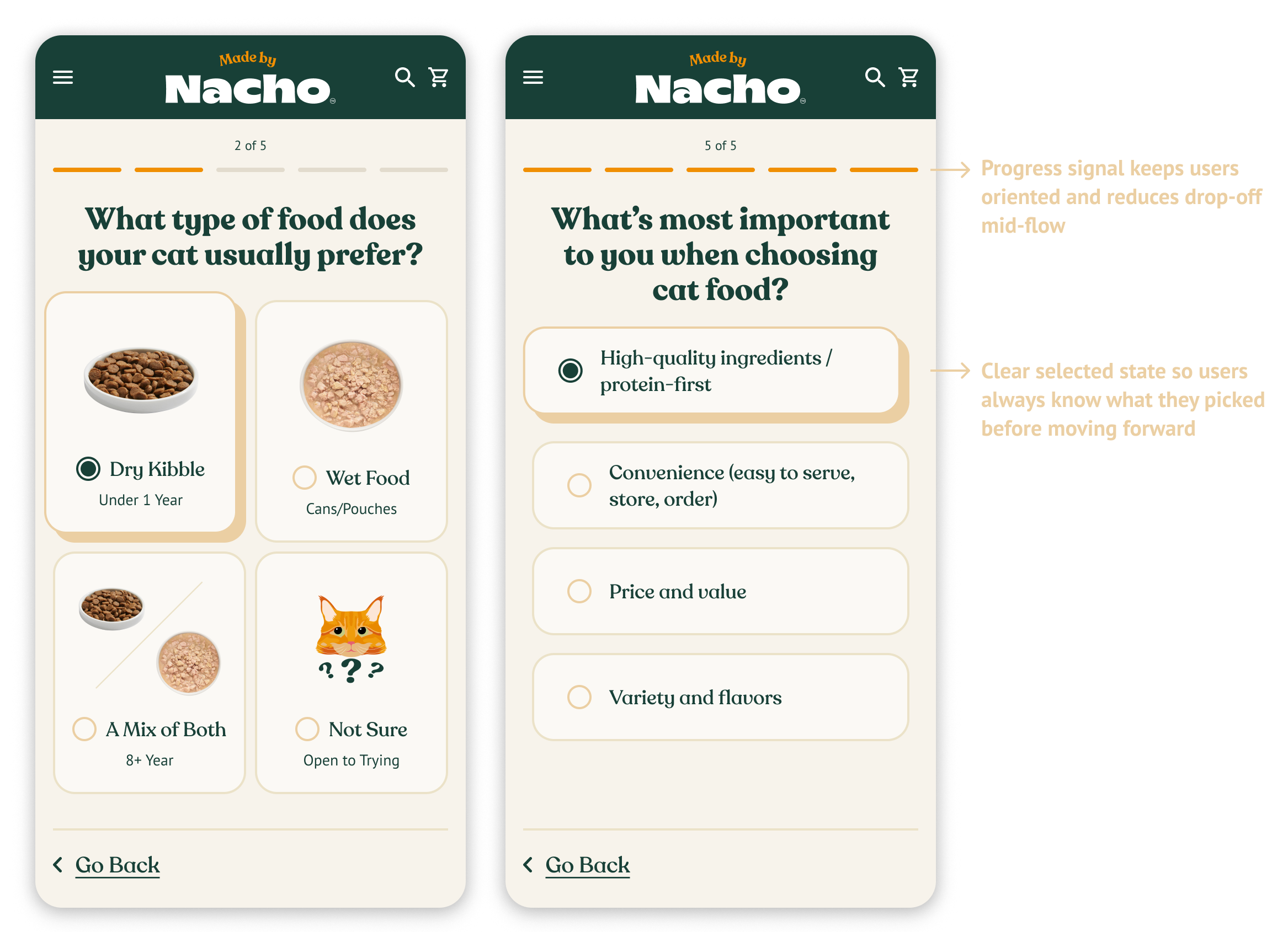
The client provided the questions but not the interaction patterns. I designed the button styles, selected states, and progression behavior to match the Made by Nacho brand while keeping the experience feeling fast and low-effort.
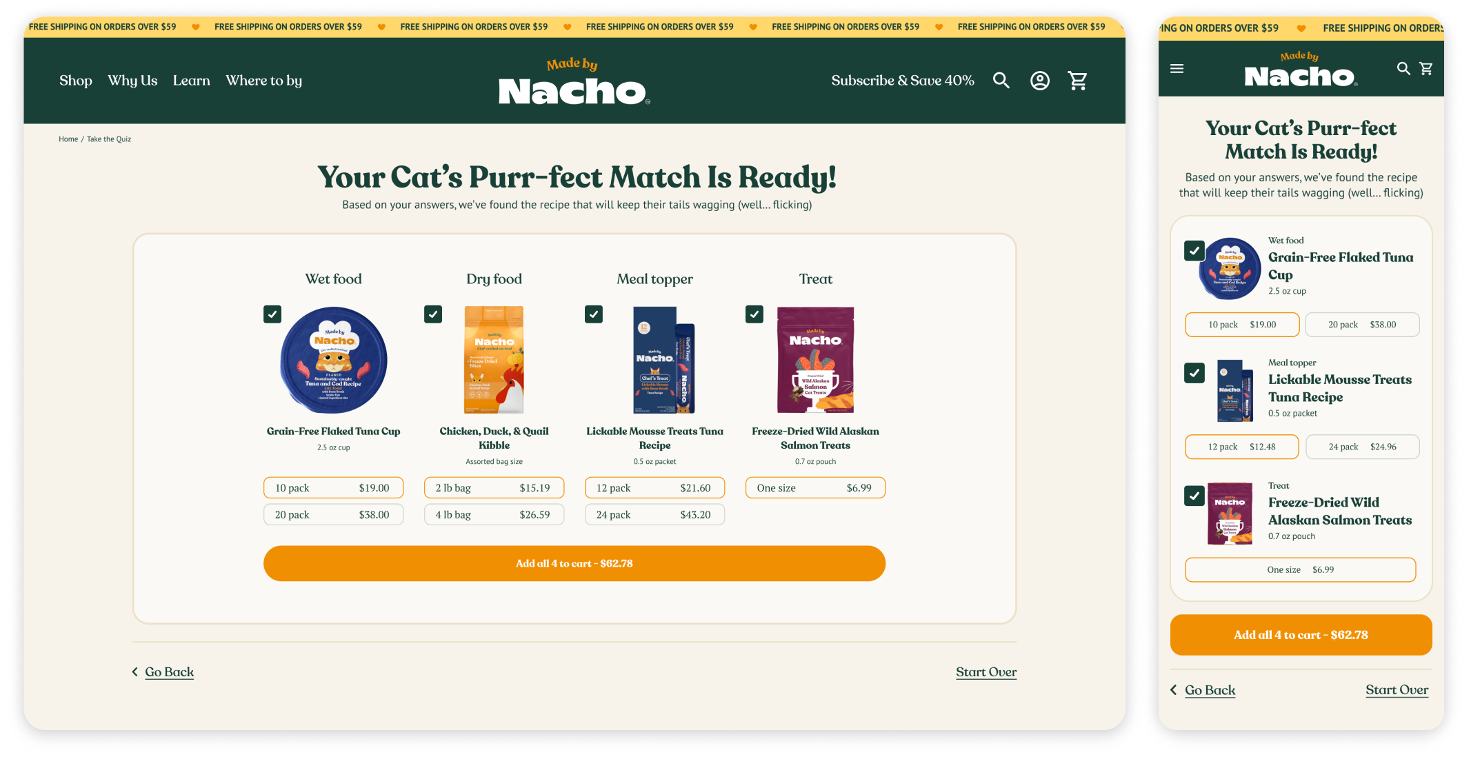
The Results Page
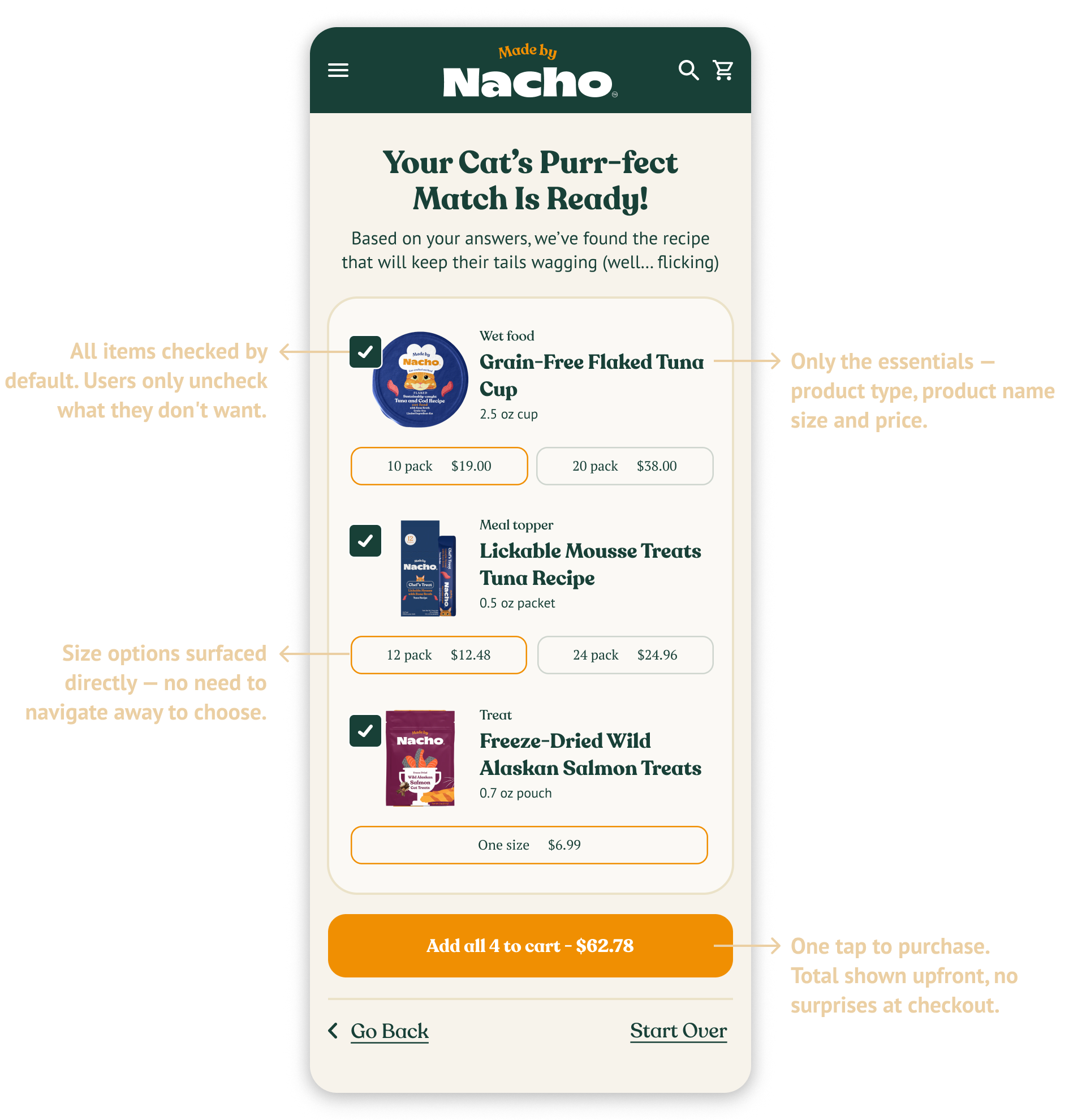
This is where the quiz had to justify itself. The goal was simple: get users from recommendation to cart in as few steps as possible.
Desktop & Mobile

The quiz was designed for both desktop and mobile. On mobile the results page required particular attention — surfacing size options and the add-to-cart button clearly on a small screen without making the page feel cluttered or requiring excessive scrolling.
Landing Page in Desktop
Enroll Page in Desktop
Internalizing website management and enhancing readability and usability
Landing Page

Enroll Page
Class Page

New Student Application

Class Enrollment


Setting Goals
Internalize Maintenance
Transfer the website builder to a platform that makes it simple for the CYMG team to update content and fix technical issues.

Clear Enrollment Steps
Seperate user flow for application and class enrollment. Display step by step guide to the users for clarification and setting expectation.

Responsive Design
Create a website responsive to both desktop and mobile for optimal user experience.

Readable Contents
Build a strong visual system. Use legible fonts and appropriate spacing to enhance readability.

Instant Feedbacks Upon Submissions
Implement automated pop-up screens and emails upon submission to set expectations for users and reduce workload for CYMG team.

Modern Aesthetic on Logo & Website
Redesign logo and the website with the modern yet classic look.
92 screens (46 desktop+46 mobile) were redesigned and rebuilt from scratch in WIX website builder.
92 Screen Designs Built in WIX

Solution Highlights
Website Transfer to WIX
WIX's intuitive website managing tools and good customer service enabled Internal website management
WIX Owner App expedited communication with users
WIX forms providing valuable insights to the organization

Landing Page with all the Essentials
Services and offerings communicated clearly and quickly
Call-to-action (CTA) prominently displayed to motivate users to take actions
Social proofs (introduction videos and testimonials) effectively displayed to build trust and credibility

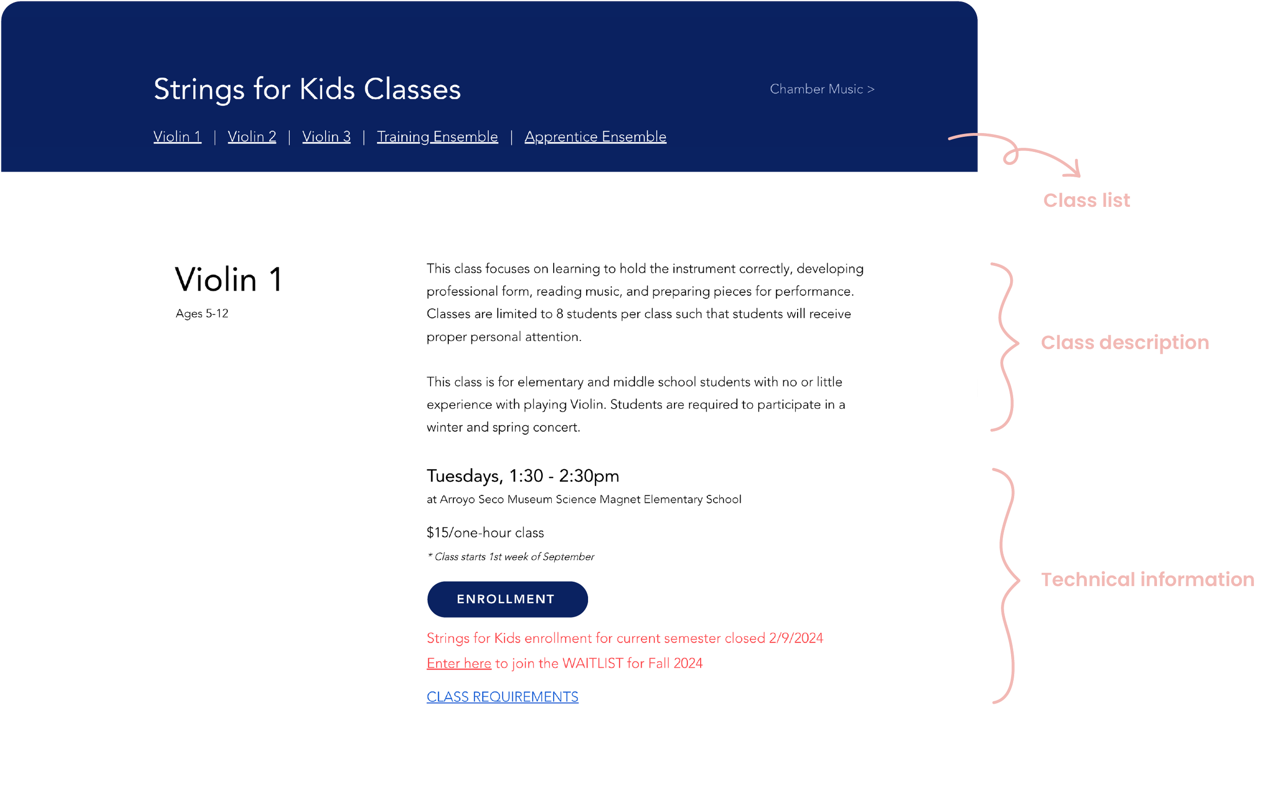
Easy to Navigate & Scan with New Visual System
Class list displayed on top, setting expectation and improving navigation
Grouping and prioritizing class informations with new visual system, improving scannability
Clear Enrollment Steps
Setting separate paths for “Application" and "Class Enrollment", eliminating ambiguous process of "Registration"
Enrollment process displayed in simple steps for clarification and setting expectation

Setting Class Enrollment Deadline
Enrollment deadline is set to ensure timely class formation and prevent delays in practice dates
Reinforcing the Enrollment Deadline
Enrollment deadline prominently displayed across the website, including the calendar, to reinforce the newly implemented policy


Class Enrollment Form Simplified
Now featuring only 10 sections instead of the previous 22, making it easier to complete the form after separating it from new student application

Automated Feedback after Form Submission
Setting up automated email with users next steps reduced workload of CYMG team
Confirmation responses right after form submissions improved user experience


Reflection
Main Challenges and Lesson Learnt
The primary challenge during the process was gathering accurate information necessary to move the project forward. This was because the person holding the key information, the organization's president, wasn't easily reachable, and I attempted to navigate around this without directly contacting her. I realized that it’s important to be proactive and reaching out directly, even if someone appears busy, rather than delaying progress.
Next Steps
One aspect I overlooked during the website redesign process was SEO, as I lacked sufficient knowledge about it. However, I'm eager to offer to enhance their SEO, which would enable me to learn more about it as well as they can really get the benefit of having much better website.