
CYMG Website Redesign and Branding
Overview
CYMG is a non profit music academy in Los Angeles California. They needed a revamp for their malfunctioning website and outdated logo to attract new students and grow the organization.
I not only enhanced the user experience and aesthetics of the website but also reconstructed the site from the ground up using a new web builder, allowing for internal management.
Role
Website Redesign: Website Design Audit, Visual System, Website Development Using Existing Template
Branding: Logo Redesign
Timeline
March - August 2023
Summary
Website malfunction due to difficulty in website maintenance
Low readability on desktop and mobile
Confusing user flow for application and class enrollment
Difficulty forming classes due to lack of enrollment deadline
Outdated branding and visual design
Current Challenges
Solutions & Impacts
Website builder transfer > Enabled internal website management by transferring website from Wordpress.org to WIX
New visual system > Improved readability by creating hierarchy in information
Streamlined enrollment process and set enrollment deadline > Addressed the issue of timely class formation, preventing delays in practice dates
〰️
〰️
What Clients said
“The new enrollment process and deadline mostly resolved the issue of securing commitment in time from students.”
“The new website really helped us see the whole picture in one place and track attendance, tuitions and more. “
〰️
〰️

Landing Page in Desktop

Enroll Page in Desktop

Defining Problems
After I analyzed the existing website and user flows, I found 5 major problems that need to be adressed
The dropdown menus were dysfunctional, preventing users from accessing most pages. This was due to the difficulties maintaining the website "Wordpress.org" website builder without professional expertise.
Low readability on desktop and mobile

Large blocks of small texts and poor visual hierarchy made it challenging for users to locate and read information effectively. Additionally, there was no separate mobile version available.
Confusing and unclear user flow on registration

The existing "Registration Form" served a dual purpose; an "Application" and a "Class Enrollment". However, this dual functionality caused confusion or redundancy to users, as some questions were irrelevant for new users, while many were redundant for existing users.

Registration deadline was non existence, leading last-minute registrations, creating challenges in organizing ensemble groups before the semester starts, consequently delaying the initiation of the first session.
Lack of feedback

Session delay due to absence of registration deadline
The form submission process failed to provide feedback or guidance regarding the next steps. For instance, upon submission, users did not receive confirmation of whether the form was successfully submitted or not.

Broken site due to difficulty in maintenance
Setting Goals
Streamline Maintenance
Choose a website builder that is easy to use and allows for efficient content updates and management.
Clear Registration Steps
Seperate user flow for application and class enrollment. Display step by step guide to the users for clarification and setting expectation.
Responsive Design
Create a website responsive to both desktop and mobile for optimal user experience.
Readable Content
Build a strong visual system. Use legible fonts and appropriate spacing, to enhance readability.
Automate Feedbacks Upon Submissions
Implement automated pop up screens and emails upon submission to set expectations for users as well as reduce workload for CYMG team.
Modern Aesthetic on Logo & Website
Redesign logo and the website with the modern yet classic look.
There were a total 110 screens (55 desktop+55 mobile) that needed to be designed from scratch.
Building Website

Transfer to WIX
WIX's intuitive platform and exceptional customer service enable the CYMG team to manage the website internally without professional assistance. Additionally, WIX's backend tools like the WIX app and forms expedite communication with users and provide valuable insights to the organization.
Solution Highlights
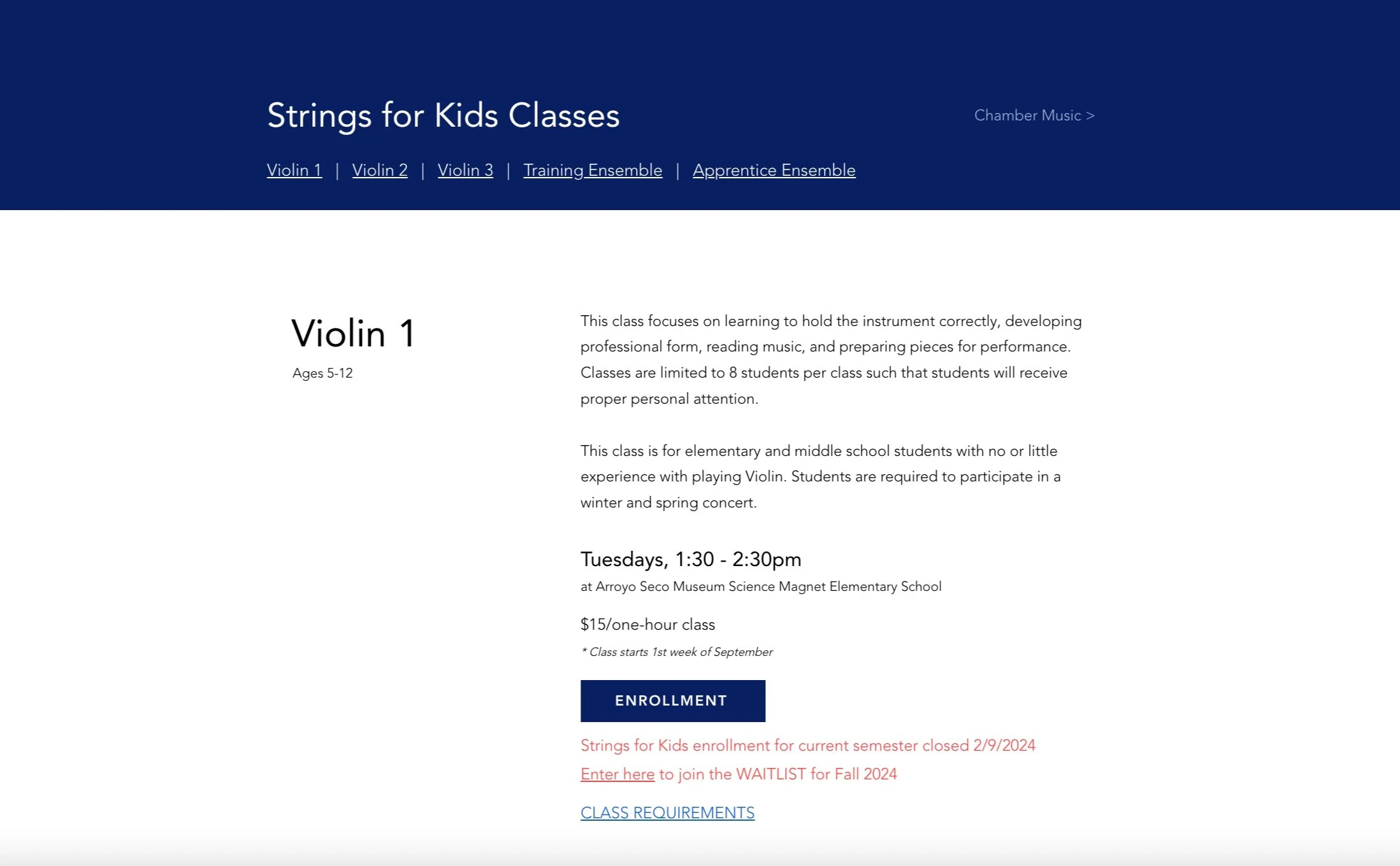
Scannable contents
The implementation of a new visual system has enhanced visual hierarchy and typography, making content easily scannable. Additionally, by hiding "Class Requirements" within a pop-up window, cognitive load has been effectively reduced.
Streamlined enrollment user flow
The user flow is now streamlined with distinct paths for "New Student Application" and "Class Enrollment," eliminating the ambiguous term "Registration" for improved clarity. Additionally, prominently showcasing the "Application and Class Enrollment Process" ensures users have clear expectations from the start.

Setting Enrollment Deadline and Calendar
Implementing new enrollment deadline has addressed the issue of timely class formation, preventing delays in practice dates.


Simplified Class Enrollment Form
Existing students can now complete the enrollment form more efficiently, as unnecessary questions have been removed. The updated form, with only 10 sections compared to the previous 22, significantly reduces time and stress.

Acknowledgement emails and pop up screens
TBD


Work in progress